NovaCare Designing a Transparent, Trustworthy UX for Allergy Patients.
Overview
A pharmaceutical company specializing in allergy treatments needed a patient-facing website that conveys transparency in research, medication offerings, and patient resources. The site was designed to align with their digital marketing efforts and serve as a trusted reference for doctors and patients.
Stakeholders requested a clear, engaging, and user-friendly design that departs from traditional clinical aesthetics while maintaining trust and professionalism.
Role
Product Designer
Skills
User Research
Competitive Analysis
Wire framing
Prototyping
Information Architecture
UI Design
Know the User
Patients and caregivers are often overwhelmed by complex medical information. They need a platform that presents clear, evidence-based content without overwhelming them with technical jargon or excessive marketing.
The Goals
Prioritized easy access to reliable medication information, balancing data-driven content with an approachable visual style to build trust. It aimed to educate users clearly and concisely while avoiding overwhelming layouts. Interactive tools, like branded vs. generic comparisons, enhanced decision-making.
Approach
I conducted user interviews, developed personas, and analyzed competitors to understand user needs. I improved navigation and layout for better readability and easy access to key information. The design balances aesthetics and usability, creating a modern, engaging, and trust-driven website.
Challenge
Patients struggle to find transparent, easy-to-understand medical information. Many pharmaceutical sites prioritize marketing over clarity, making it difficult for users to trust the content. How might we create a website that prioritizes patient trust while maintaining credibility and professionalism?
Solution
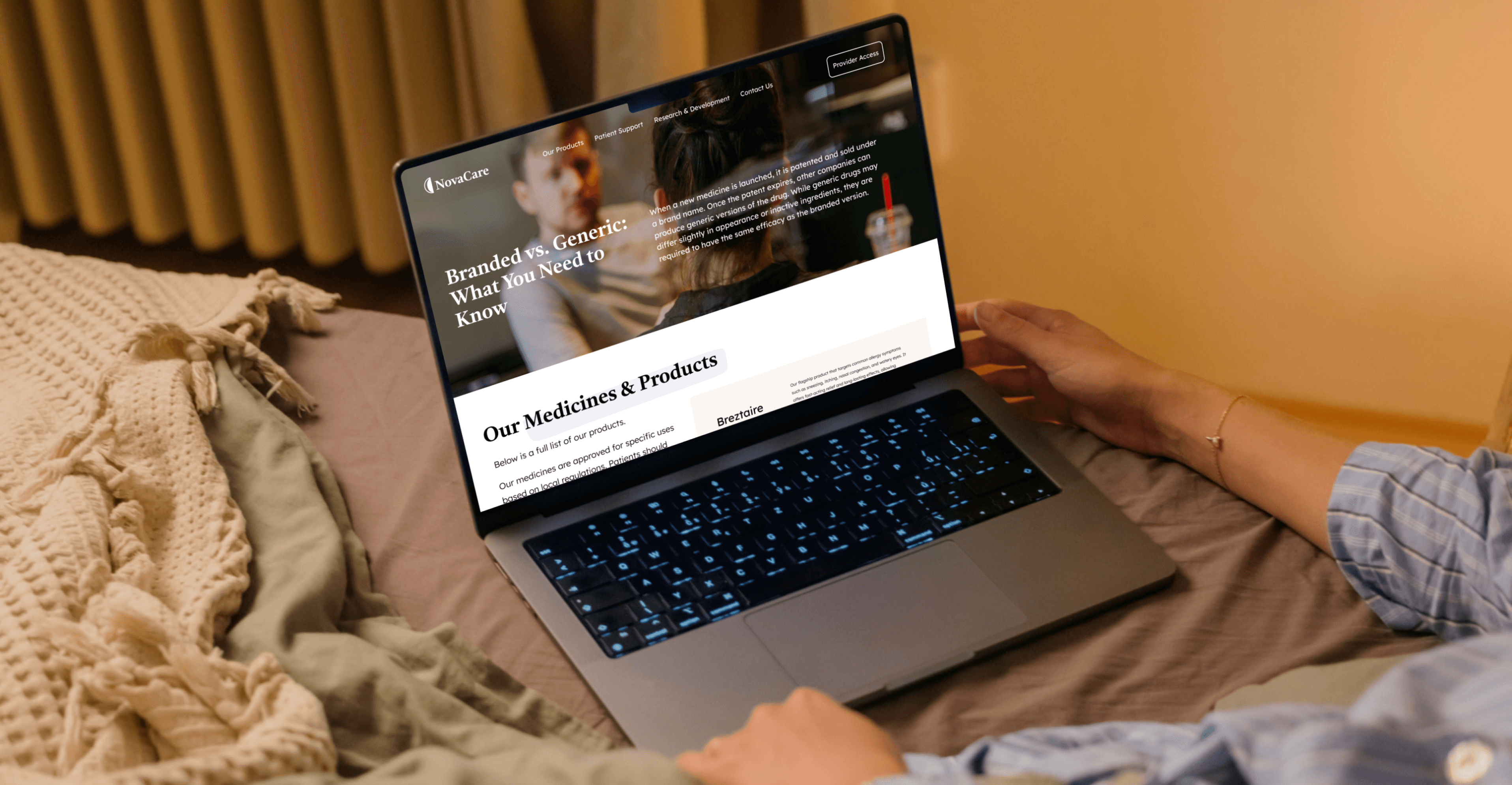
I designed a research-backed UX that blends transparency, trust, and usability. The website offers clear navigation, patient-centered content, and interactive tools to help users make informed medical decisions with confidence.
Still with me?
Let’s Prescribe a better user experience.
User Interviews & Personas
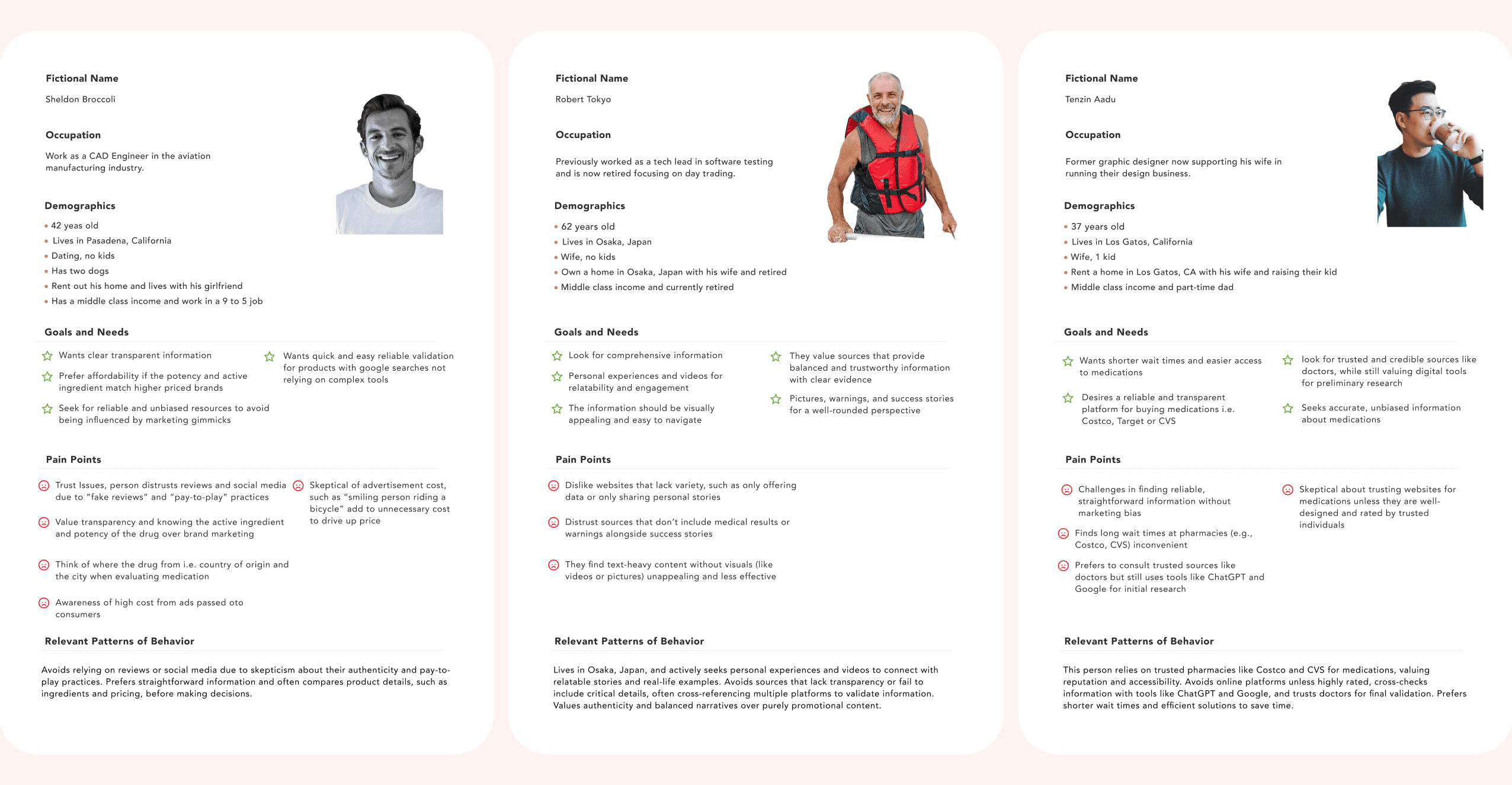
To better understand patient needs, pain points, and expectations, I conducted user interviews and identified key personas.
Sheldon Broccoli, a 42-year-old CAD Engineer, seeks clear, affordable, and unbiased medication information to make informed healthcare decisions.
Robert Tokyo, a 62-year-old retired Tech Lead, prefers comprehensive and well-balanced content that is visually appealing while maintaining credibility.
Tenzin Aadu, a 37-year-old former Graphic Designer, relies on trusted sources for medical information but also values the convenience of online research tools.
Key Findings
Users want unbiased, clear medical information without marketing-heavy messaging.
Navigation should be straightforward and intuitive for easy access to key details.
Visual hierarchy plays a crucial role in building trust and credibility.

Competitive Analysis
I conducted an in-depth analysis of GSK, Genentech, Pfizer, and Allergy Therapeutics to identify industry best practices and uncover areas for improvement. Our research focused on evaluating homepage design, the structure of product page content, and the effectiveness of trust-building elements in enhancing user confidence.
What I Learned
• Leading Pharma brands use structured, research-backed content to enhance credibility.
• There’s an opportunity to create interactive tools that empower patients in their decision-making.
User Flow & Sitemap
To create a user-friendly experience, we structured the website into three primary pages.
The Homepage serves as the main entry point, highlighting research credibility, product offerings, and key resources.
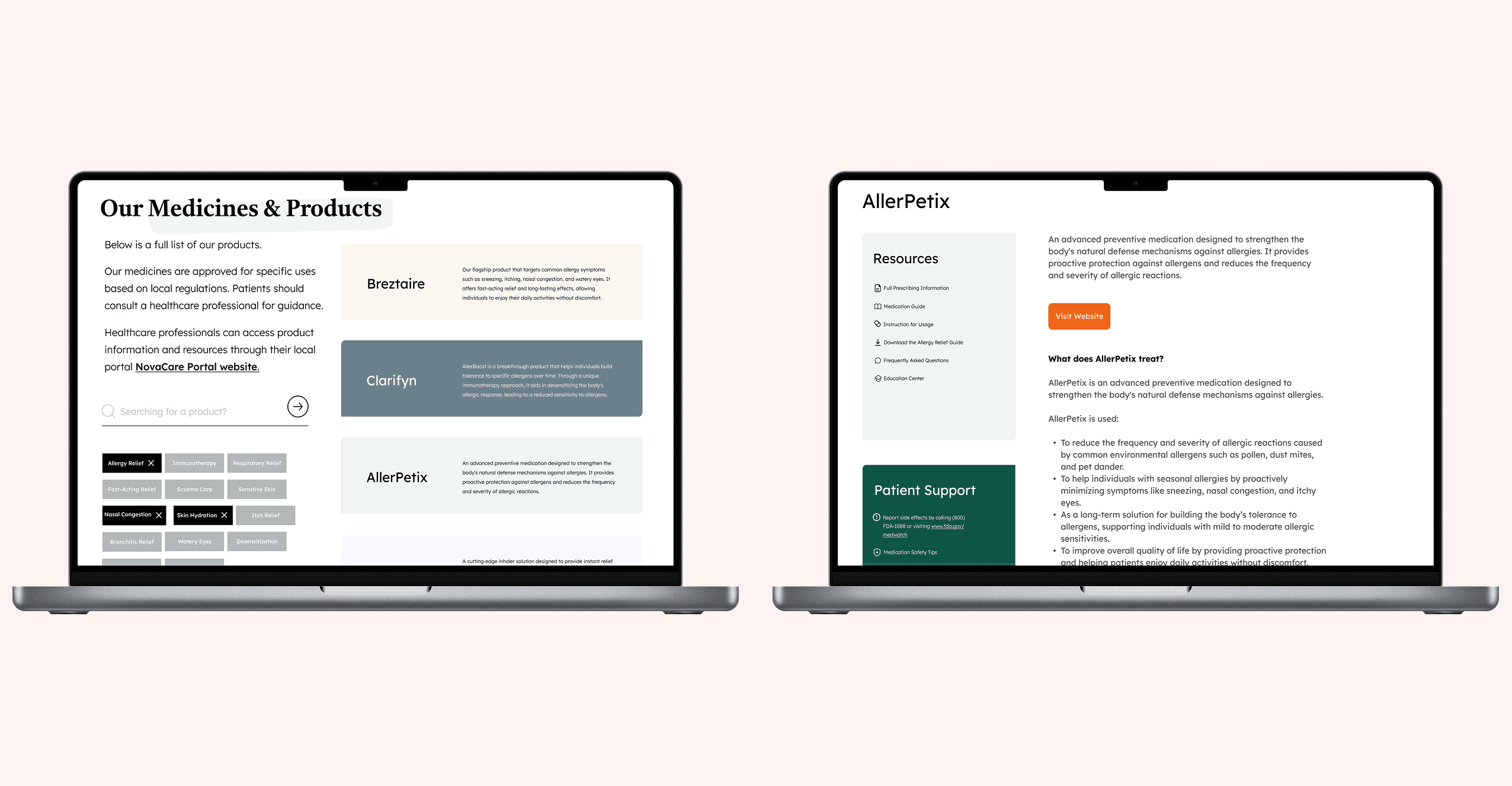
The Product Page features a searchable list with comprehensive product descriptions and educational content to inform users.
Lastly, the Product Detail Page provides an in-depth breakdown of ingredients, efficacy, and safety warnings, ensuring users can access all necessary medical information with ease.
Why?
By breaking the site into three core pages, we ensured that users could easily navigate between general research, product exploration, and detailed medical breakdowns. This structure prioritizes accessibility and transparency

Wireframing & Prototyping
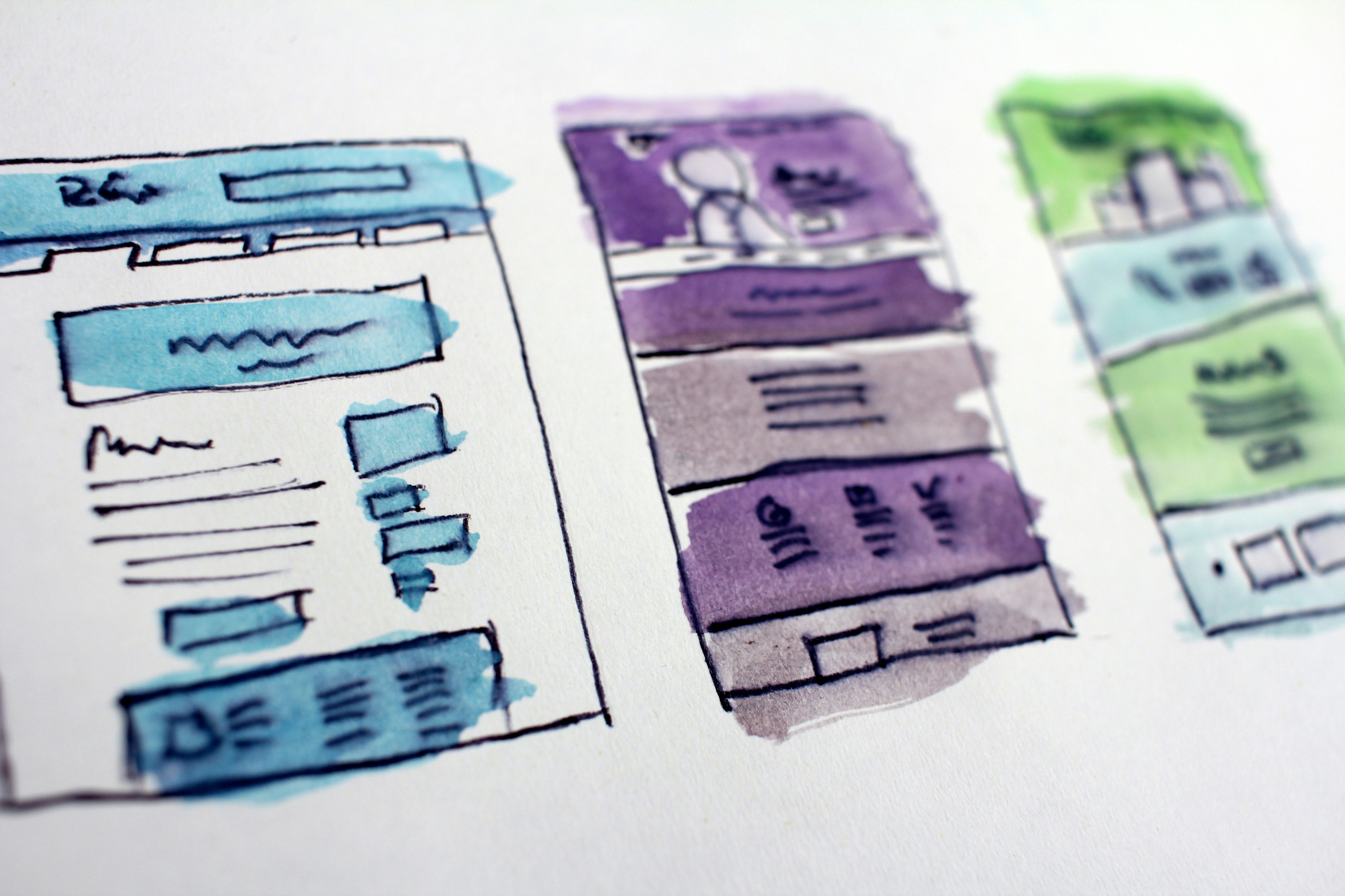
Low-Fidelity Wireframes involved the initial exploration of layout concepts to define the content hierarchy and ensure a logical flow of information.
High-Fidelity Designs were then developed to bring the visual execution to life, incorporating a muted, organic color palette to strike a balance between approachability and trust.
structuring content and testing user flows
Low-Fidelity Wireframes focused on structuring content and testing user flows before investing in visual design.
High-Fidelity Designs refined usability with a professional, modern aesthetic that enhances trust.
UI & Visual Design
UI & Visual Design
Typography & Colors were carefully selected to ensure readability and credibility, making the content accessible to a wide audience.
Infographics & Data Visuals were incorporated to break down complex medical concepts into easily digestible formats, enhancing user comprehension.
Interactive Comparison Tools were designed to assist users in evaluating branded versus generic medications, helping them make informed decisions about their treatment options.
Design Principles
A muted, organic color palette was chosen to convey trust and transparency, ensuring a professional yet approachable feel without appearing overly clinical.
Carefully selected typography enhances readability, ensuring that medical content remains clear, accessible, and easy to digest for all users.
Interactive tools, such as branded vs. generic medication comparisons, enhance engagement by keeping users informed, involved, and empowered in their decision-making.
Final Design Enhancements
To build trust with users, we reduced reliance on marketing-heavy visuals, ensuring a more transparent and credible presentation. Educational content was placed higher on product pages to better align with user expectations and provide immediate access to essential information. Additionally, we implemented accessible navigation improvements to create a more intuitive and seamless browsing experience.

Key Takeaways
Achieving a balance between trust and engagement is essential. Users need clear and unbiased content that does not overwhelm them with excessive visuals. A data-driven approach to design proves to be effective, as research-informed layouts and well-structured content enhance credibility. Additionally, users tend to prefer straightforward information over marketing-heavy content, reinforcing the importance of transparency and clarity in design.
Next Steps
Moving forward, we aim to refine the experience further through iterative usability testing and enhanced interactive tools. I will also explore the implementation of indexed navigation to enhance accessibility and provide a more structured approach to in-depth product pages. Additionally, I aim to enhance interactive comparison tools to improve user engagement and support better decision-making for patients and caregivers.